
Key Concepts
This article will cover four key areas that can harm a website’s accessibility and are very easy to overlook. Use these summary points as a quick reference or for a learning opportunity. After reading, try revisiting these points and recall what was covered.
Color and Contrast
Color contrast can pose a huge problem for some visitors to your site – if they are unable to read what you have to say they will leave. Normal text on your site should have a contrast of level of 4.5:1 and large text needs to meet a 3:1 ratio to meet accepted standards.
Don’t forget about text placed on images and videos too. The easiest method to keep contrast in these cases is to use a colored overlay to ensure your text stays readable.
Accessible Images
Images can make a website look great, but can pose problems for those with vision problems. To ensure these visitors receive the same experience, write meaningful alternative text for screen readers.
When using an image as a link this is even more important. In these cases the alternative text should describe the interaction and not the image.
Tab Focus Outline
While most users will interact with a mouse there are other assistive technologies that need to be considered as well. These can include the keyboard, touch screens, speech recognition devices, or virtual mice. It is important to consider that these devices may not have a visual location indicator or have the fine control that a mouse offers.
Try testing the main interactions on your website with just a keyboard. How easy is it to do? What were some of the hurdles you faced in performing it?
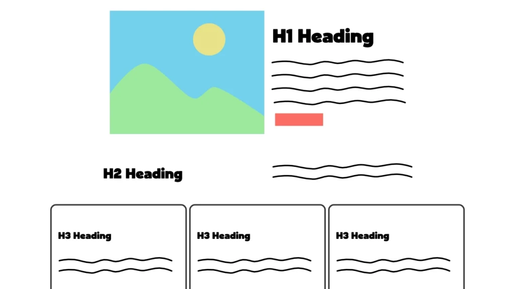
Heading Sequence
This is not only important for accessibility, but just a generally good practice to follow. For sighted users proper headings are easy to skim and help to find what is the most relevant. With a screen reader they function as navigation points for a user to skip to. Improper heading use and sequence can make this type of navigation confusing or just not possible.
Colour and Contrast
From the WebAIM Million Report, the top accessibility issue is low contrast text. Low contrast text is any text that does not contrast enough with the background behind it. The combination of colours or placing text on an image can cause low contrast. Accessibility guidelines require a contrast of 4.5:1 for normal text and 3:1 for large text. These ratios allow most people to read your content without difficulty.
Testing for Contrast
There are many different tools that allow you to test the contrast ratio between colours. My favourite is the WebAIM Contrast Checker tool which is a free online tool provided by WebAIM. It is easy to use and even provides extra resources on the subject.
Accessible Images
Images are a great way to add visual interest and break up large blocks of text. They are also a great way to showcase products or services. But what about those who can’t see these images? For the best experience you need to have a way to give them the same experience and information. That is the job of alternative or alt text – providing a text description of the image for screen readers.
Screen readers are a form of assistive technology made for people with low vision. Adding good alt text to your images will ensure that the experience is equal for those that need it.
How to Write Alt Text
- Keep the description concise but complete
- Omit words like image and photo as they are redundant
- Avoid abbreviations and end it with a period to help screen readers announce it
- Always include the attribute, even if it is blank
- For an image that serves as a link, describe the action and not the image
You can also read this article from the NN Group that covers this topic in great detail.
Tab Order and Focus Indicator
Many users of a website will navigate using a mouse. This provides an easy method of clicking, scrolling, or interacting with it. The mouse pointer also lets you track where you are and what you can click.
But what happens when you are not using a mouse? How do you know what you can click on or where you are on the page when using a keyboard? Using the tab, enter, and arrow keys you should be able to navigate a website from top to bottom. Pressing the tab key will change focus to the next item that you can interact with – usually buttons and links. That is when focus indicators and tab order become essential.
All web browsers outline the focused item to provide that same context a mouse pointer would. This shows where you are and what you can interact with. Some websites will add styles that remove this focus outline. Doing so means that it is now much harder to navigate without a mouse.
Problems to Look For
Ask yourself these questions when checking how well your website handles keyboard use. Any visible interactive element needs to be able to get focus and it should do so in a left to right, top to bottom order.
- Does a visible, focused element have an outline?
- Do any invisible elements receive focus?
- Are any links or buttons skipped when pressing the tab key?
- Does pressing tab take you to the next logical element? Example: After opening a sub menu in your navigation, do they get focused next or skipped over?
Heading Sequence
What are Headings?
Headings are HTML elements that serve the purpose of describing the topic or purpose of a section of a web site. These can range from an H1 that describes the entire page down to an H6. Headings included inside of a section should use the next heading level in sequence. The further nested a heading is, the higher the number that should used.
Impact of Heading Sequence
Headings are very useful for users to scan and pick out the information that is the most relevant to them. But, they also serve a very important function for users of screen readers. Headings on a page get announced to the user along with the level of the heading. This is key in understanding the structure and relationship of the content on a page. Using headings out of order can cause a lot of confusion. The first heading read should be the H1 – this helps to orient the user and ensures they are on the page they expect to be on.
Another feature of screen readers is they allow navigation based on page headings. Using correct headings lets a screen reader user scan the page with ease and navigate between each section.
So, how does your website handle these common problems? If you need help fixing them, get in touch and I can lend a hand getting your site more accessible.